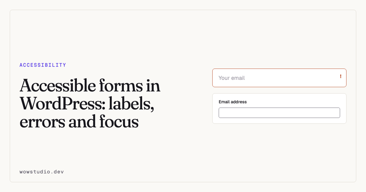
A placeholder is not a label. If you remember one thing from this page, that is the one, because it is the most common form failure on the web and the easiest to fix.
Forms matter more than the rest of your site put together. Somebody who cannot read a paragraph has lost some information. Somebody who cannot complete your checkout has lost the transaction, and you have lost the sale.
1. Every field needs a visible label
Placeholder text disappears the moment somebody types. It is usually grey enough to fail contrast. Screen reader support for it is inconsistent. And anybody interrupted mid-form comes back to a row of filled boxes with no indication of what each one holds.
<!-- Fails -->
<input type="email" placeholder="Your email address">

<!-- Works -->
<label for="email">Email address</label>
<input type="email" id="email" name="email" autocomplete="email">
The for attribute must match the input’s id. That association is what makes
the label announced, and what makes clicking the label focus the field.
Use the placeholder for an example of the format, if at all. Never as the only name.
Labels that are visually hidden
Sometimes the design genuinely has no room, as with a search field beside a button. Hide the label visually, not from assistive technology:
<label for="s" class="sr-only">Search this site</label>
<input type="search" id="s" name="s">
Never display: none. That hides it from screen readers too.
2. Say what went wrong, in words
Turning a border red communicates nothing to somebody who cannot see it, and little to somebody who can.
An error message needs to:
- be text, not only colour
- say what is wrong and how to fix it — “Enter a date as DD/MM/YYYY”, not “Invalid input”
- sit next to the field it concerns
- be associated with the field via
aria-describedby - be announced when it appears, via a live region
<label for="phone">Phone number</label>
<input
  type="tel"
  id="phone"
  aria-describedby="phone-error"
  aria-invalid="true"
>
<p id="phone-error" class="error">
  Enter a phone number with at least 10 digits.
</p>
Move focus to the first error on submit. Somebody who cannot see the page has no idea anything failed otherwise.
3. Required fields
Mark them in the markup, not only with an asterisk.
<label for="name">Your name (required)</label>
<input type="text" id="name" required>
required is announced. A red asterisk is not, unless you also explain what it
means somewhere a screen reader will reach.
4. Group related controls
Radio buttons and checkboxes that belong together need a fieldset and a
legend, or the question is never read out — only the options.
<fieldset>
  <legend>How did you hear about us?</legend>
  <label><input type="radio" name="source" value="search"> Search</label>
  <label><input type="radio" name="source" value="friend"> A recommendation</label>
</fieldset>
Also worth doing
Autocomplete. autocomplete="email", autocomplete="name",
autocomplete="tel". It is a WCAG 2.1 criterion, and it makes forms faster for
everyone.
Target size. Checkboxes and radios are small by default. Make the label part of the hit area, which the markup above already does.
Do not disable the submit button until the form is valid. A disabled button gives no explanation and is not focusable, so a keyboard user cannot even reach it to find out why.
Do not time out silently. If a session expires, say so and let people recover what they typed.
Test it with a keyboard. Every field, every option, submit, and the error state. See testing with a keyboard.
Forms built by plugins
Here is the catch that affects tooling rather than visitors.
Contact Form 7, Gravity Forms, WPForms and the rest generate their own markup. A site-wide fix that labels WordPress’s own search and comment fields will not reach them, because they are not WordPress’s fields.
Accessibility Remediation’s comment-search-labels and label-form-fields
fixes say exactly this in their caveats: they cover core forms, and forms built
by a plugin have to be labelled where they are built. The full list is in
Site-wide fixes.
That is not a limitation worth hiding. A tool that claimed to fix every form on your site would be lying to you about your checkout.
Questions people ask
Is aria-label an acceptable substitute for a visible label?
It makes the field announced, so it is better than nothing. It still leaves sighted users with no label once they start typing. Use a visible label where you can.
What about multi-step forms?
Say which step you are on in text, move focus to the new step’s heading when it changes, and never lose what somebody already typed.
Does my contact form need a CAPTCHA?
A visual CAPTCHA is a barrier. A honeypot field and a timing check stop most automated submissions and are invisible to real people — which is what this site’s own contact form uses.
To find unlabelled fields and missing form structure across your site, the plugin is free on WordPress.org.