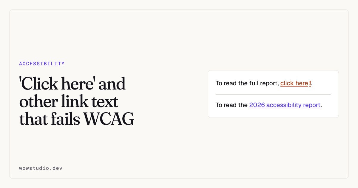
Link text has to make sense when read on its own, with no surrounding sentence. That is the whole rule, and it fails because of how screen readers are actually used.
Most screen readers can list every link on a page so the user can jump straight to the one they want. On a typical WordPress blog that list reads:
read more, read more, read more, click here, read more, here, read more
Which tells the listener nothing at all.
The phrases that fail
click here · here · read more · more · learn more · this ·
this page · link · continue · details · download
They fail for the same reason: out of context they identify nothing. “Download” is a particular trap, because a page often has six of them.
A bare URL is also poor. A screen reader reads it character by character, so
https://example.com/2026/reports/accessibility-q3.pdf becomes a long,
unpleasant recitation.
What to write instead
Put the destination in the link.
| Instead of | Write |
|---|---|
| To read our report, [click here]. | Read the [2026 accessibility report]. |
| Download [here]. | Download the [price list (PDF, 240KB)]. |
| [Read more] | [More about our plugin development] |
| [Learn more] about us | [How we work] |
[https://example.com/pricing] |
Our [pricing] |
The links are now self-describing, and the sentences read better for everyone.
“Read more” on archive pages
This is the hard case, because the phrase repeats by design and WordPress themes generate it.
Three ways out, best first:
1. Make the post title the link. The title is already unique and descriptive, and most readers click it anyway.
2. Include the title in the link text. Read more about heading structure.
Verbose on screen, perfect in a link list.
3. Add visually hidden text. Keep “Read more” visible and append the title in a class that hides it visually but not from screen readers:
<a href="/blog/heading-structure">
  Read more<span class="sr-only"> about heading structure</span>
</a>
.sr-only {
position: absolute;
width: 1px; height: 1px;
padding: 0; margin: -1px;
overflow: hidden;
clip-path: inset(50%);
white-space: nowrap;
border: 0;
}Do not use display: none for this. It hides the text from screen readers too,
which defeats the point.
Links that open a new tab
If a link opens in a new window or tab, say so. Somebody who cannot see the new window appear will press Back, and Back will not work.
<a href="/report.pdf" target="_blank" rel="noopener">
  2026 report (PDF, opens in a new tab)
</a>
Better still, do not open new tabs. Let people decide that for themselves.
Links to files
Name the format, and the size if you can. “Annual report” that turns out to be a 14MB PDF is a bad surprise on a phone with a metered connection.
Annual report (PDF, 2.1 MB)
Accessibility Remediation has a site-wide fix,
download-file-info,
that adds this automatically to links in your content, taking the size from
your media library.
Links marked only by colour
A link inside a paragraph distinguished from the surrounding words by colour alone fails WCAG 1.4.1. Anyone who cannot separate those two colours cannot tell it is a link.
Underline it. That is what the criterion wants and what readers already recognise. There is a site-wide fix for this too, and a browser-pass check that finds them.
The related checks
| Check | What it catches |
|---|---|
link-name-missing |
A link with no accessible name at all |
link-text-not-descriptive |
Known vague phrases |
link-opens-new-window |
A new tab with no warning |
link-to-file |
A document link that does not name its format |
link-anchor-broken |
A link pointing at an anchor that is not there |
link-not-keyboard-reachable |
Something styled as a link that a keyboard cannot reach |
link-marked-by-colour-alone |
Colour as the only signal |
The phrases treated as vague are adjustable through the
wsak_vague_link_phrases filter, which matters if your site is not in English
or has house terms.
Questions people ask
Is “click here” always wrong?
In practice, yes. Even where the sentence makes it clear, the link list will not.
Can two links have the same text?
Only if they go to the same place. Two links reading “Contact” pointing at different pages is a failure.
What about icon-only links?
They need an accessible name, usually a visually hidden label or an
aria-label. An icon with no name is announced as “link” and nothing else.
To find every vague link on your site, the plugin is free on WordPress.org.