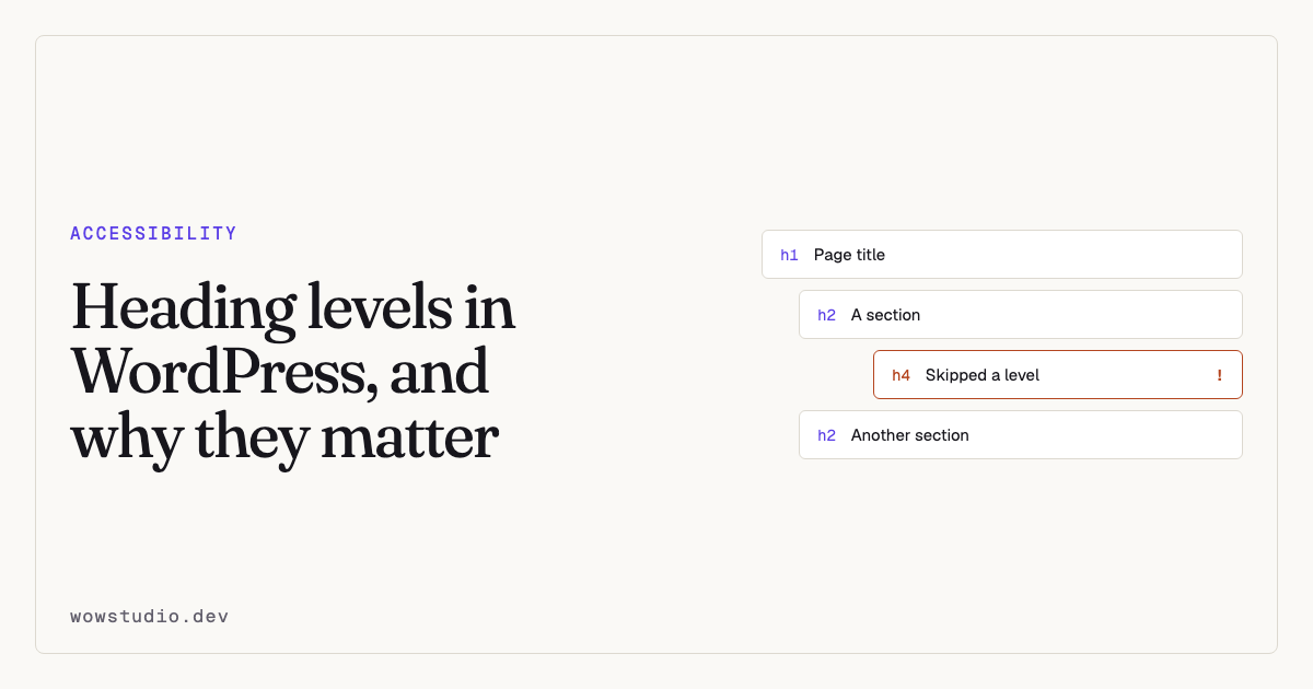
Headings are the table of contents screen reader users navigate by. Most screen readers offer a shortcut that jumps between headings, and many users reach a page, pull up the heading list, and read from that.
If your headings are chosen for size rather than for structure, that list is gibberish, and the fastest way around your page is broken.
What a correct structure looks like
- One
h1per page, describing what the page is. - Levels descend by one. An
h2may be followed by anh3. It may not be followed by anh4. - Levels may jump back up freely.
h3back toh2is fine and normal. - Headings describe what follows them. Not what came before, not the brand.
That is the whole specification.
h1  Accessible WordPress sites
  h2  Why headings matter
    h3  How screen readers use them
  h2  What breaks them
    h3  Styling by size
    h3  Page builders
  h2  How to fix it
What breaks it in WordPress
Choosing a heading because of its size
The commonest cause by far. Somebody wants smaller text, picks h4 instead of
h2, and the structure silently breaks.
The fix is to use the right level and change the size in CSS. Visual size and semantic level are independent, and they should be.
Bold text standing in for a heading
A paragraph in bold looks like a heading and is not one. It will not appear in the heading list, so for a screen reader user that section has no title at all.
There is a specific check for this, and it is flagged as needing a person, because only you can tell whether a bold line is a heading or emphasis.
Themes that put an h1 in the header
Some themes mark up the site name as h1 on every page. Now every page has two
h1s, or the real page title is demoted.
The site name belongs in a p or a div, styled however you like. The h1 is
the page.
Page builders
Elementor and similar builders make it easy to drop a heading widget set to any level, anywhere, with no visibility of the document as a whole. Sections get duplicated between pages and the structure drifts.
Widgets and sidebars
Widget titles are frequently h2 or h3 by default, interleaving with your
content headings and producing an order that makes no sense when read as a list.
How to check it
Read the list, not the page. Any browser extension that outlines headings will do. So will your screen reader’s heading list. If it reads as a sensible outline of the page, you are done.
Watch for the three classic faults: no h1, more than one h1, and a
skipped level.
Accessibility Remediation runs checks for each of them —
document-title-missing, multiple-top-headings, heading-level-skipped,
heading-empty, page-has-no-headings and bold-text-as-heading. The full
list with severities is in
Every check.
Fixing a site that is already wrong
Do it in this order, because it saves the most work:
- Fix the theme first. If the header or footer emits a bad heading, every page is affected and one template change clears all of them. Grouped findings make this visible: a fault your theme repeats is judged once rather than once per page.
- Fix templates and archive pages next. Same leverage, smaller blast radius.
- Fix individual pages last. By this point there will be far fewer than the first report suggested.
Questions people ask
Does Google care about heading structure?
Search engines use headings to understand a page, so a sensible structure helps. But the reason to get it right is that people navigate by it.
Can I have more than one h1 if I use HTML5 sections?
The HTML5 outline algorithm was never implemented by any browser or assistive
technology. Treat it as not existing: one h1 per page.
My design needs a small heading. What do I do?
Use the correct level and set the font size in CSS. That is what CSS is for.
Is a skipped level really a failure?
It maps to WCAG 1.3.1, Info and Relationships. It is a genuine barrier when somebody is using the heading list to understand how a page is organised.
To see your heading structure as a machine reads it, the plugin is free on WordPress.org.