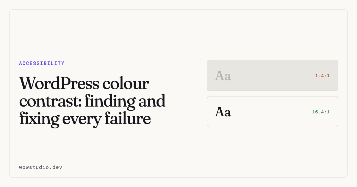
Body text needs a contrast ratio of at least 4.5:1 against its background. Large text needs 3:1. Large means 24px, or 19px if bold. Those numbers are WCAG 2.2 Level AA and they did not change from 2.1.
Contrast is the most common failure on most WordPress sites, usually because a designer picked a mid-grey for body copy and nobody measured it.
The thresholds, in full
| What | Minimum ratio |
|---|---|
| Body text | 4.5:1 |
| Large text (24px, or 19px bold) | 3:1 |
| Icons and essential graphics | 3:1 |
| Borders of real controls | 3:1 |
| Focus indicators | 3:1 against adjacent colours |
That last row is WCAG 2.2’s addition. A focus ring nobody can see is not a focus ring.
Logos and purely decorative graphics are exempt. Disabled controls are exempt, although a disabled control nobody can read is still a bad control.
Why your checker disagrees with another one
Three reasons, and they come up constantly.
Font size and weight. 19px bold is large text at 3:1. 19px regular is not, and needs 4.5:1. A checker that does not know the computed size cannot apply the right threshold.
The actual background. The colour behind your text is often not the colour you set. It may be a parent’s background showing through a transparent child, a gradient, or an image. A checker fed two hex codes cannot know this. A checker reading the rendered page can.
Rounding. 4.49:1 fails. Some tools round to one decimal and report 4.5.
This is why contrast genuinely needs a browser. The arithmetic is trivial; knowing what colour is behind the text is the hard part.
Text on images
This is the case tools get wrong most often, and the honest answer is that it frequently cannot be settled automatically.
If the background is a photograph, the effective contrast changes across the text. A checker will either pick one pixel and give you a confident wrong answer, or tell you a person has to look.
The second is correct. Accessibility Remediation reports these as needing a person rather than guessing, which is the reason it implements contrast itself rather than borrowing an engine that would answer confidently.
If you have text over an image, the fixes that work are a solid scrim behind the text, a sufficiently dark overlay across the whole image, or moving the text off the image entirely.
Fixing it in WordPress
Find the real values first. Pick the colour from the rendered page, not from your brand document. Themes and page builders override each other constantly.
Change the text, not the background, where you can. Darkening body copy is usually invisible to the brand and clears the ratio immediately.
Keep the hue. You rarely need a different colour, only a darker or lighter one. Move lightness and leave hue and saturation alone, and nobody will notice except the people who could not read it before.
Watch your greys. #777 on white is 4.48:1. It fails. #767676 is 4.54:1
and passes. This is the single most common near-miss on the web.
Check both themes. If your site has a dark mode, every pairing needs checking twice. A palette that passes in light often fails inverted.
Where to put the CSS
Not in the theme files, unless you control the theme and are not going to update it. Use the customiser’s Additional CSS, or a child theme.
Accessibility Remediation writes its own contrast corrections into your site’s Additional CSS, specifically so you can read, edit or delete them without the plugin. It computes a colour that clears the ratio while keeping the hue and saturation you already chose, moving only as far as it must.
When a fix does nothing
Specificity. Your theme styles the same element with a more specific rule and wins.
The plugin re-measures after applying a rule and tells you when this has
happened rather than reporting success. Where the blocking rule is marked
!important, nothing can outrank it, and it says so instead of pretending.
Questions people ask
Does contrast apply to placeholder text?
Yes. Placeholder text is text. It is also a bad substitute for a label — see accessible forms.
What about brand colours that fail?
Use them where contrast does not apply: large display type at 3:1, logos, decorative blocks. Use an adjusted version for body copy. Almost every brand palette has a usable darker variant.
Is 7:1 required anywhere?
Only at Level AAA, which most organisations do not target. 4.5:1 is the AA requirement.
To find every contrast failure on your pages, including the ones only a browser can see, the plugin is free on WordPress.org.